Topics: Programming
I'm able to get a good grasp on big-picture stuff relatively easily. However, I don't have a great memory for technical details, even stuff that I do almost every day. I imagine my co-workers are freqently amazed that I can even remember how to put on pants in the morning. I know people who are able memorize the fine details of complex systems, and regurgitate them at will, sometimes years after the fact. I'm not one of them.
Silicon is a personal wiki/note-taking applicaiton that I wrote to make me slightly less of an idiot.
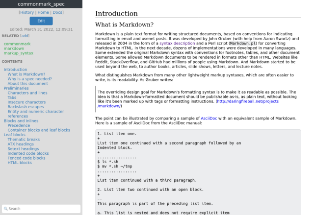
I wrote this to suit the way my particular brain wants to work. I have tried many others and a few came close but none quite hit the mark. It took a great deal to convince myself that it was worth my time to reinvent one of the most commonly reinvented classes of wheel.
For many people who make things, building your own tools is not just a rite of passage or a thing to show off, it's part of the trade. Blacksmiths and woodworkers have been making their own tools for centuries. All auto mechanics eventually find themselves welding together a makeshift wrench for a particularly hard-to-reach nut or bolt. Developers and other tech-minded people are no exception.
The following are a few of the intentional design descisions for this tool and their rationale.
Function over Form
It's only natural that as a field of technology progresses, innovation and novelty slow down. The fruit on the lower branches gets picked early on and pretty much all of the basic and important software is free or cheap enough to not matter. After a while, it becomes a challenge to come up with something truly new and interesting and thus many programs attempt to introduce novelty not essential to the program's function or try to stand out through visual design. This is the current trend in software development, especially for personal productivity and programming tools.
It's not hard to understand why. When you want users to see your work--or perhaps as often, employers and clients--you need to grab their attention. Applications that look interesting are desirable for that. Or at least it certainly helps with "spreading the word" through our present-day visual web and social media.
Designing software is an inheriently creative process, but there is often a tension between engineering a program that does its job efficiently, and making it visually interesting in order to attract attention. A good balance can often be struck but when programs are presented as tools and end up veering into "art project" territory, functionality usually suffers to some degree or another.
Case in point: There is a gentleman on YouTube who likes to take old bicycles and old engines and combines the two into motorcycles, with a bit of artistic flair added in the form of items and materials lying around the shop or purchased from yard sales. The results are striking, he ends up with beautiful, one-of-a-kind hand-built machines that are glorious to look. However, nearly all of them offer a terrifically awful riding experience. Now, generally the throttle works as it should. But the ability to stop once you get going can be a bit hit or miss. The handling might be terrible, the ride is bumpy, the seat painful, and you'll get your flesh nicely seared if you touch the wrong thing at the wrong time. He enjoys the process of building these machines and his creations are wonderful, but he also doesn't try to pass them off as daily road-worthy riders.
Back to software: when it comes to Getting Stuff Done, I'd rather use an ugly tool that works well than a beautiful one that has lost sight of its purpose. And of course, bonus points for unburnt flesh.
The following is an incomplete list of things that Silicon doesn't have and likely never will because they don't add value to (or worse, subtract value from) my daily workflow:
- Parts that fade in and out of existence
- Things that move around for no pratical reason at all
- Animated widgets and backgrounds
- Fancy-pants fonts
- Scroll bar hijacking
- Emoji. (🏈 🐺 🌴 🌴 🌴)
Web-Based
The app is web-based for the following reasons:
-
I need the Internet to do almost anything at the computer anyway. (I can quit any time I want, I swear.)
-
Syncing notes between platforms is a hard problem, unless you delegate it to something like Syncthing or Nextcloud, which adds a layer of fragility and setup cost to every platform you use to access your notes. Git is also a solution here, but if you switch between several devices per day (like I do), then you're constantly running (or forgetting to run) Git commands to keep your notes in sync everywhere.
-
I want to access my notes from potentially any computer without having to install something special. Even a phone, tablet, phablet, or Steam Deck.
-
I know how to write Python, HTML, CSS, and only enough Javascript to be superbly dangerous.
-
I self-host lots of other tools for myself and my family, adding another is not a great deal of pain for me.
-
Web browsers tend to be very backwards compatible with old sites and apps, (see: quirks mode) although the current leading browsers seem bent on abandoning this. Still, the web is a much more stable API than any OS UI toolkit in modern history.
Dependencies: Few, Small, and Stable
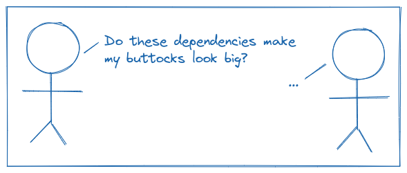
Previous iterations of this app relied on bootstrap, jQuery, larger web frameworks, etc. The problem with these is that they eventually show their age. Sure, you can pin versions and just keep using them forever like some kind of pleb, and you might even get away with it! But eventually a security vulnerability or incompatibility with a modern version of the programming language comes to bite you in the buttocks. And the size of your buttocks grows bigger as the number of dependencies grow.
I plan on using this app for the rest of my life. But maintaining it is not a hobby. (I have more than enough of those already.) Despite wishing quite intently for it, I am not yet immortal and there is a lot more I want to do before my clock winds down. I want to spend as little time as possible working on this tool going forward, in order to allocate more time to raking in millions my family, friends, and actual hobbies.
To these auspicious ends, I am relying on dependencies that will save me greatly in up-front as well as long-term costs and shunning those that offer mainly convenience (like an ORM, CSS toolkit, or flashy Javascript UI framework). I believe the trendy people call this "boring technology" nowadays. I chose dependencies that are relatively small, easy to understand, and if not mature are at least apparently stable and therefore unlikely to impinge upon my buttocks dramatically in the future. I also hope that I have structured things in a way that will make it relatively easy to swap out parts for better or more available versions in the future.
Markdown Syntax
I'll admit that I resisted using Markdown when it was just catching on because it had all the hallmarks of a fad. Despite what my multitude of cheering fans say, I am fallible, and Markdown is not actually half-bad, even if it is somewhat ill-defined. Many major sites and apps promote (if not require) its use and I have since taken to writing Markdown even in places where it will never be rendered into HTML, like text files and emails.
Why not a WYSIWYG editor? A few reasons:
- The lack of skill/desire to write one.
- The lack of desire to pull one in as a dependency. (See above.)
- Even the best WYSIWYG web editors tend to be buggy and have "edge cases" sharp enough to lop off a limb or two.
- I am a lot faster at getting my thoughts into writing with the needed style cues inline, as text, than I am with keyboard shortcuts and clicking toolbar icons.
Least Cognitive Load
I use lots of software on a daily basis that tries to be everything to everyone and as a result, cannot be customized for individual use cases. This slows you down more than you realize until you've stood back to look at it. Even small annoyances encountered frequently enough add up to significant cognitive load that has no return on investment.
Prior to my iterations of this tool, all of my notes were kept in a self-hosted instance of Dokuwiki. As wiki systems go, it's quite close to the top of the heap for being easy to set up and use. The main things that took me away from it were the lack of native support for Markdown and the editor UI.
The editor UI, you say? Yes. Eventually, bit by bit, day by day, it managed to drive me mad. I can't really explain it, but editing big multi-page documents in a text area that's only some fraction of the total browser window just, like, got to me, man. To the point that it became a distraction. Yes, I might have re-themed the thing or something to solve this but I didn't want to learn PHP (again) and also learn how to hack on Dokuwiki, plus there were other things I wanted out of it.
Another intentional design decision was omitting the ever-present changelog line present in most wiki software. These are just my own notes, I don't have to justify updating the content to myself!
Data Permanence
One of the reasons I liked Dokuwiki was that it was one of the few full-featured wikis that did not need a database like MySQL or Postgres always running in the background. You can just cd to the data directory, and there are your pages, in plain text.
I wrote a prototype hoping to do something similar, but found that you make some trade-offs when you try to turn a file system into a simple document store:
-
Want to keep every version of a page? Now you have to invent (or preferably steal) a file-based revision system. And then things get... not so simple.
-
Want to search all pages? Implementing a basic search feature on a tree of files is not terribly difficult. (How hard is it to grep a directory?) But if you want search operators, you're left with writing your own query parser, or bringing in a library to do it. And then eventually you need an index. Dokuwiki solved this by writing their own moderately complicated page index system. You could pull in a full-text search application that does all of this for you (e.g. ElasticSearch) but those tend to be quite heavy.
-
If you later decide to add any metadata to pages beyond a title and timestamp, you have to invent a sytem to store those too.
After looking at all the options, I decided that storing pages in SQLite was the best way to go for my purposes:
-
Although the pages are "locked up" inside a database, SQLite is so mature and ubuquitous that it seems like there is zero risk that the notes in the database will ever be unreachable, no matter how far technology progresses in the rest of my lifetime. It is fairly trivial to export the contents, should we desire. (And we certainly desire.)
-
We can trivially implement page history by simply storing every edit to a page as a new row in a table. The "current" version of a page is simply the one with the newest timestamp. Listing, retrieving, and comparing old versions becomes easy as well, as far as the data layer is concerned.
-
SQLite has rather amazing full-text-search and indexing built right in! All you need are minor additions to your schema and it Just Works.
-
Extra page metadata is easy to add by just adding more columns and perhaps light munging some of your existing model code.
-
One data file is easier to "handle" than a tree of files, e.g. for backup or data migration purposes.
SQLite is small, solid, and ubiquitous. After plain text, there is no more portable or future-proof way to store data. Aside from the full-text search--which is just an implementation detail--the schema for Silicon is simpler than even the most heinously brain-damaged SQL tutorials that litter the first few results when you google, "how do i make an SQL?" Commands to import and export data just are one-line queries on the command line.
One trade-off being deliberately made here is that even if you delete a page full of text, the database never gets smaller. Perhaps even more annoyingly, a one-character change to a large page containing several thousand words ends up writing a new full copy of the page to the database. The short story is that I am fine with this. My own database containing at least a decade of notes is around 30 megabytes. That's not even a drop in the bucket when today's hard drives are measured in terabytes.
But let's say we did want to decrease the space used for some reason. These are some of the options:
-
You could put a limit on the number of previous revisions saved for every page. That number could be zero (for no page history at all), or an arbitrary number of days/months/years. The drawback is that problematic word arbitrary. Everyone will have a different idea of what number is appropriate for them and the choice they make now might not be the choice they want later. And what if you had a very small page with thousands of edits that you wanted to keep forever, but a very large page where you only want the last ten? These might be contrived, but corner-cases often appear that way right up until you hit them.
-
You could set a time period after which all old revisions are "expired" across the whole database. Similar drawbacks to the above, but with time as the dimension instead of number of edits.
-
You could save each page as either a "full" or an "incremental" revision. A full revision is a complete copy of that page while an incremental revision contains only the differences between it and the previous one. This makes it very efficient to store small changes to large pages. But it also introduces complexity (and therefore fragility) to the code: Every time a page is pulled up to view or edit, the code may have to "compute" the full copy of the page by combining a previous full revision with one or more incremental revisions. A formidable--but not impossible-- challenge is designing an algorithm that decides whether a given revision should stored as full or incremental.
-
You could compress the data. If SQLite offered optional compression built right in, then this would be the easiest choice to make. Alas, it does not. There are extensions that can do this, but those always come with a maintenance and/or cost down the line at some point.
In my estimation, the "problem" of having a few tens of extra megabytes isn't nearly severe enough to address with such drastic measures. Especially if we're not looking at at least an order of magnitude improvement.
Search is King
But where are the tags? The heirarchy of pages? The namespaces? What kind of incomplete shite is this anyway?
I have climbed upon the mountain and return to dispense the following wisdom upon ye humble folk: Metadata curation is a hobby.
Now, I can already hear the sharp intakes of breath, the knuckles cracking, fingers poised over keyboards to tear me a figurative new one for such an obviously ridiculous statement, so I have to qualify it: metadata is essential for large collections of multi-dimensional data shared among a group or community. For my own notes, I've reached the conclusion that metadata is (usually) a waste of time.
Previous iterations of this project supported tags and heirarchical pages. But I found that no matter how hard I tried, I ended up using them inconsistently across varous subjects. Some subjects lent themselves to a nice obvious heirarchical system, others worked better with tags. Still others didn't fit either well.
First I dropped support for tags because managing an accurate list of relevant tags for each and every page, and reviewing them on every edit, became a chore that I grew to loathe. Plus on the development side of things, saving tags with each revision meant an extra layer of metadata. Since the FTS5 search engine in SQLite is excellent, tags became a labor-intensive redundant feature.
Then I got rid of heirarchies too. I found that I only ever used them in one section (my notes on Python) and found myself having to look up the linking syntax involving namespaces. Every. Single. Time. Again, thanks to FTS5, I found that I could do "soft" namespacing via page title prefixes (e.g. "python_operators" instead of "python/operators") and just find everything I need through the search which returns matches on both titles and body text. These days, the pages that make up my section of Python notes look something like this (after slugifying the page names):
- python
- python_operators
- python_functions
- python_classes
- python_virtual_environments
- (et al)
To put it another way, I want my database of notes to be a tool. They have very low value on their own, but very high value in conjunction with my day-to-day work. Any time spent "curating" them is time subtracted from getting more important things done.
I ended up making one small concession to the altar of metadata, however. I found that many of my pages contained a separate section pointing to other related pages. Usually, this relationship is bidirectional. So my page titled "Geese" should have a link to the page "Abominable Waterfowl" and vice-versa. (I don't actually have these pages, please just humor the example.) Instead of editing both pages and manually writing links in each, you just click [add] in the sidebar and enter the name of the related page. Now both pages have a bi-directional relationship to each other and you see the other page's title on each page.
I'm pretty happy with how that turned out and I use it all the time. The nice thing about this feature is that it's part of the sidebar, meaning the list can be edited immediately while you are reading or editing the page without scrolling away from whatever you were working on. Less friction == more good.
The Future
I consider this program "done" in the sense that it currently does everything that I need it to do. Obviously I will want to update dependencies once in a while as they get too stale. I am intrested in improvements (and you can read about them in the README), but the current form is quite likely to stick. Bells and whistles are things that eventually become what we in "the industry" call technical debt.
That's a Wrap
To be clear, I'm not out to change anyone's mind about how they develop software but hopefully this inspires some critical thought. All engineering is about critical thought and balancing objectives and resources when it comes right down to it.
Now before you go, just one last thing...
