Topics: Linux

Even though I have been using some Linux distribution or another pretty much daily for roughly two decades, I have not had occasion to write a review on one. Today, opportunity knocks not once but 18.04 times.
Background
Just who in blazes are you and what qualifies you to do a Linux distribution review? you are likely asking yourself. Well then, answer the first: I am a Linux system administrator by trade. And have been now for what seems like ages. I'm an open source advocate who is incredibly set in my ways and I want the tools that I use to just work. I detest paying for software except when it occupies certain specialized cases or represents something more akin to work of art, such as the video game Portal. But only when it's on sale. Over the years I have made many contributions to a wide variety of projects in various forms, mostly in the form of bug reports and patches.
Answer the second: I have a blog. So there.
This review is going to be a little bit different from others in that I am completely unfamiliar with the modern stock Ubuntu desktop since GNOME 2 was abandoned. I started on Ubuntu back in the "badger" days when it was basically a lightly modified GNOME 2 desktop. Once Ubuntu's default desktop switched to Unity and GNOME 3 was released at about the same time, I found immediately that neither of them would work for me. So I bounced around a bit between various desktops like Cinnamon and MATE before finally settling on XFCE via Xubuntu over the past few years. It's not quite where GNOME 2 was before it was abandoned but it's pretty darn close. Today, we're going to see if Ubuntu 18.04 ("Bionic Beaver" or as I like to call it, "The Beav") and its GNOME 3 desktop is usable for someone as finicky as me.
Criteria and Trial by Fire
I am going to be judging Ubuntu 18.04 like an elderly lady judges canteloupe at the produce market. Carefully, with an experienced eye, and bearing no tolerance for ugly bits, soft spots, or flim-flam. These criteria may appear to be arbitrary to you but there are things that have caused me to give up on distros and desktops in the past. They are generally in the "just make it freaking work already" category that should not, really, be impossible to get right here in 2018. (a.k.a. THE FUTURE.)
What I'm not going to do is prattle on about what's new and exciting in this release compared to all the previous ones because frankly dear, I don't give a damn about all that.
Finally, a disclaimer: The criteria by which I judge this new Ubuntu are my own. That means that I weigh certain things that I care about quite heavily while things that most people care the most about might not get any mention at all. If you're looking for a balanced critique of overall usability for the populate at large, this ain't it.
First Impressions
I fired up Bionic in a virtual machine (KVM) to get a sense for whether or not I was going to hate it right out of the gate. My understanding is that 18.04 is basically GNOME 3 with some amount of tweaking, which I also have not used up until today.
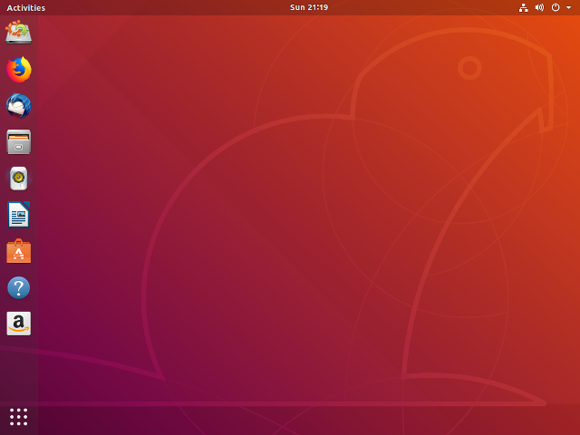
Okay, not too bad. It was a little surpising that the icons in the upper-right area of the screen were basically all one big button instead of independent widgets but I think I can live with that. At this point, I don't know quite what "Activities" is, although there is a search bar in there which is apparently for looking up installed applications.
The bar on the left is obviously a vertical imitation of the Mac OS X dock. In the lower-left corner, there's an icon with a grid of dots that takes you to some kind of overlay thing that shows all the applications. You can search here too. I think I would have preferred an ordinary heirarchical menu here. The icons are gigantic and spaced far apart and any text longer than 10 characters gets cut off. I presume this is supposed to be another imitation of Apple design, the iPhone home screen.
I opened up a few terminals, web browser, etc just to see how the window management was going to work. The application that has focus shows up in the bar at the top but this is definitely not anything like the classic windows task bar. When you click on the application's name, you get a pull-down menu of some kind of random selection of actions. I'm not entirely sure what purpose this is supposed to serve since you could just as easily access these things from the application's window itself.
I notice that when you drag a window near the panel or the top of the screen, the panel and top bar go from translucent to almost solid gray. If there's a reason for why that happens, I can't tell what it is.
Suspend
The act of powering up a computer, waiting for it to boot, doing some work, and then waiting for it to shut down gracefully is a barbaric ritual from ancient times. In 2018, we're all modern and hip and just want to open up the laptop lid and get to work. Unfortunately this is easier said than done and as such it really only works reliably with the right combination of supported hardware. And even then, bugs in various layers of the OS can cause it to suddenly stop working consistently after an OS update. Ask me how I know.
- Suspend and resume must work, without crashing the X session, video, or anything else.
- Pass. The only issue I had is that pause button in the upper-right menu got replaced with a power button and I only discovered by accident that holding down "Alt" will change it to a suspend button. Bonus points for an option in the settings to allow the power button to suspend the machine as well.
- OS must suspend when laptop lid is closed, every time.
- Pass. This only works when the laptop is not connected to another display, which makes sense I guess.
Multiple Display Support
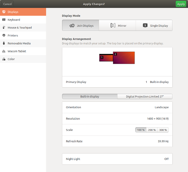
Both my work and personal machines are laptops. But I also have external monitors in both locations. There's zero point in even having a laptop on your desk if you can't pick it at a moment's notice and take it to a meeting and then come back without having to manually tell it about it's new reality vis-a-vis number of displays and manually rearranging windows on the screen each time something changes. GNOME 2 and MATE always did this perfectly every time. Not much else that I tried since has. XFCE has gotten close but only recently. Here's what I hope Bionic can accomplish without too much drama:
- When a second external display is connected, the OS should only ask me once how I want the desktop to be displayed across the screens. (Mirrored, extend the desktop, etc.) Every time thereafter, it should remember what I told it earlier (for that particular monitor) and just do the right thing.
- Pass. Ubuntu didn't actually ask but it did the right thing which was to put the second monitor off to the right of the laptop's display. And configuring the displays in the settings is extremely straightforward. High marks to whoever designed that bit of heaven.
- When the external display is disconnected, it should automatically shrink the size of the desktop and move all windows back to the laptop's display.
- Pass. Worked exactly as described.
- When the external display is connected again, the windows that were on it before should be automatically moved back to where they were if, and only if, they were not moved around by the user while the display was disconnected.
- Pass.
- All of the above should work as described even if the displays come and go while the laptop is asleep. XFCE usually just crashes if you do this.
- Pass although it's possible that this is an intermittent problem that will show up in vanilla Ubuntu eventually too.
Multiple Audio Device Support
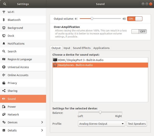
My laptops have internal speakers and microphones along with ports on the devices themselves as well as the docks they plug into. I generally use all of them for different purposes at different times.
- I should hear sound out of the main speakers when I play a cat video on YouTube.
- Pass. Cat noises observed.
- When the laptop is docked, it should route sound through the audio ports on the dock.
- Pass.
- When I plug in headphones, it should mute the speakers and route sound to the headphones and do the reverse when I unplug them.
- Pass.
- The volume control should adjust the volume of the device that has the audio routed to it.
- Pass.
All in all, I'm pleased that all of the general-purpose audio stuff in Ubuntu works just fine right out of the box. I remember having to monkey with pulseaudio settings to get this to work right in Xubuntu.
Touchpad, Keyboard, Mouse Customization
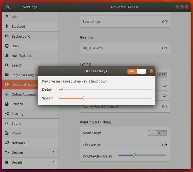
The only reason this section is here is because in the latest release, XFCE (or Xubuntu) did something crazy with their input preferences handling and now it's all broken as hell. Even when I can set the input preferences to what I want them to be, they frequently revert to the defaults whenever the system is docked or undocked, suspended or resumed, a USB device is plugged in or unplugged, etc. I've had to write scripts to work around all of this.
- Let me specifiy the keyboard repeat rate in terms of hard numbers (e.g. 200 ms delay, 50 repeat rate) instead of just unlabeled sliders.
- Fail. For one, these settings are hidden away under "Universal Access" (I'm not sure why "Accessibility" needed to be replaced with another new euphemism, but okay). This is a very odd place to put it. If you're going to hide a setting this basic and critical under here, then you might as well move all the mouse and touchpad preferences too. Secondly, these are just bare unlabeled sliders so I have no idea what the actual delay and speed are set to.
- Allow me to completely disable mouse acceleration and adjust the speed of the mouse accurately.
- Fail. There is one generic "mouse speed" slider that seems to adjust both the speed and the acceleration at once. Although I can fiddle with it to get it somewhere in the area of what I like it, there are no labels anywhere on the slider to tell me where it's at should I want to use the same setting on a different machine.
- Allow me to enable/disable common touchpad features (edge scrolling, multi-touch gestures, etc) as well offer reasonable palm detection.
- Semi-pass. I can enable and disable features but palm detection doesn't appear to work.
- Remember all of the changes I make to the defaults above across reboots, suspend/resume, docking/undocking, etc.
- Pass. All the preferences appear to stick.
Window and Desktop Management
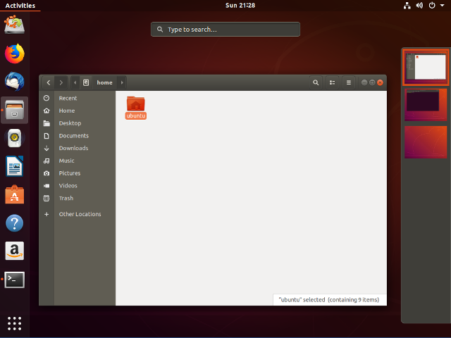
I won't deny that in certain respects I am set in my ways. You didn't ask for them, but here are some of my ways.
- I should be able to enable focus-follows-mouse in the window manager preferences. (And this feature should work largely as expected, e.g. no focusing of the empty desktop itself or icons and so forth.)
- Fail. There is no option to enable this in the standard settings window. It can be enabled with some additional software but unfortunately I found that it doesn't work smoothly enough to be useful.
- Easily resizable windows. XFCE defaults to one-pixel-width window borders. ONE PIXEL. Can you believe that?
- Pass. All four window borders are invisible but they're there.
- Multiple workspace support. Unix desktops have had this incredibly useful feature for ages.
- Fail. There's this "Activities" thing that looks like it allows you to drag windows around to different desktops but from what I can tell, that only works on the primary display. Whatever you put on the secondary monitor stays on that monitor no matter which Activity is selected. Implementing this must have taken twice the amount of time as simple separate desktops and yet only offers half the usefulness. Further, to switch between activities takes a minimum of three mouse clicks. In XFCE/KDE, one can simply click the desired desktop in the workspace widget or flick the scroll wheel on the desktop.
- Windows that snap together. When I want two windows near each other, I almost always want them right near each others with no space in between.
- Pass. But just barely. The only "snappiness" you get is when you join two windows together. There's no magnetism or snappiness, it's more like a slight stickiness.
SSH Agent
As a system administrator, a large part of my job is using SSH to log into random hosts to check on or troubleshoot things. SSH keys are how any non-insane organization handles authentication. As such, SSH private keys really, really should be password encrypted but when unlocked should be stored in an agent so that you don't have to type the password every time you log into a host.
- When I successfully log into the desktop, the OS should use my password to try to unlock the SSH keys in my
~/.ssh/directory and add them to a persistent SSH agent.- Pass. When you first try to log into a host, it brings up a dialog that asks you to unlock the private key which also contains a check box to unlock the key when you log in. Very nice.
- Bonus points if the agent can handle key types besides DSA and RSA (last time I looked,
gnome-keyring-daemondid not.)- Pass. It handled my ed25519 just as well as my RSA key.
Remote Filesystems
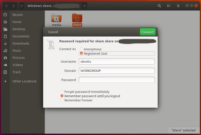
At home, I have a few NAS filesystems that I use regularly. They can be accessed as CIFS shares or via SSHFS. I'd like at least one of these to work.
- I want to be able to go into the OS file manager and tell it to mount a particular CIFS share or SSHFS filesystem over the network with minimal fuss.
- Pass. You click "Other Locations" in the file manager and then enter a URI for the remote filesystem. All popular remote file systems look to be supported out of the box.
- I should be able to save the settings for the remote filesystem such that after a reboot, I only need to click on one thing in the file manager to open the remote filesystem again. (And not be prompted for a password, etc.)
- Pass. You have to add a bookmark to the filesystem and when entering your credentials for the first time, it makes the offer to save them just for the session or all eternity.
- The file manager should not get unduly confused and ornery whenever the remote filesystem goes away because the network disappears, the laptop has gone to sleep, etc.
- Pass. I did not test this extensively but I suspended the machine and the share was perfectly browseable without complaint some time later.
External Media
I mean, I know how to mount things on the command line but it's nice if the file manager can do all the boring bits for simple cases like SD cards and USB drives.
- When I insert an SD card or USB drive, the OS should automatically mount the thing and open a file manager to it.
- Pass. I plugged in an external USB disk with an XFS filesystem and it mounted it up no-questions-asked. No window popped up, but the icon appeared on the desktop and it shows up as a removable drive in the file manager.
- When I'm done with some external media, I should be able to click on an eject button somewhere in the file manager to umount it.
- Pass. No visits from the drama llama this time.
Things That Irked Me
All of the scroll bars are about 5 pixels wide and often disappear entirely even when there's multiple pages of stuff. Call me old-fashioned but I like to be able to see where I am in a body of vertical content even when it's standing still.
There's a weird slow-scrolling effect when you grab a scroll bar and try to drag it. Often, instead of scrolling down at the rate the mouse is moved, it starts scrolling much more slowly than I'm expecting and the mouse ends up hitting the bottom of the screen before the content has scroll to the bottom. When it decides to do this is very unpredictable. I'm sure someone thought it was a good idea but this is a major usability fail just because of how unpredictable it is. I wouldn't mind some other way to scroll more slowly, but it must be more obvious and predictable.
The blatant Amazon advertising. Removing the giant "A" logo from the panel is a simple matter of right-clicking but it's not at all obvious how to get rid of it from your applications menu. (And also, Amazon is a web site not an application so it arguably shouldn't be there anyway.)
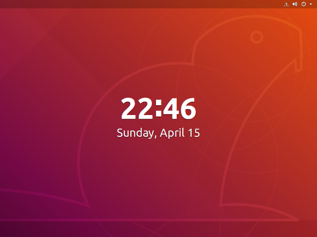
When the display goes to sleep due to lack of input or whatever, you have to drag upwards with your mouse to unlock the screen. Like some common dirty frickin' smart phone. And unfortunately, this is not obvious. After a few minutes of my second-favorite hobby, Keyboard Mashing Time, it turns out that the Esc key (and no other) will clear it as well.
Both the mouse and touchpad default to "Natural Scrolling," an abomination invented by Apple who thought that every input device that humans can lay their greasy little hands on should behave like an iPhone. I spend every day in a state of permanent quixotic hope that eventually humanity will comes to its senses and realize that computers and mobile devices are different kinds of technology with different purposes and different usage patterns.
Dragging a window to the top of the screen maximizes the window. FOR GODS SAKE WHY. There's a perfectly good Maximize button on every damn window for this purpose. Now in order to put a window at the top of the screen (which I do often), I have to drag it up, watch it maximize, and then and then click the Unmaximize button. Other desktops do this too for some reason, but I can usually disable it in them. But not Ubuntu. Is this a Windows/Mac thing? I can't figure it out.
Things That Puzzled Me
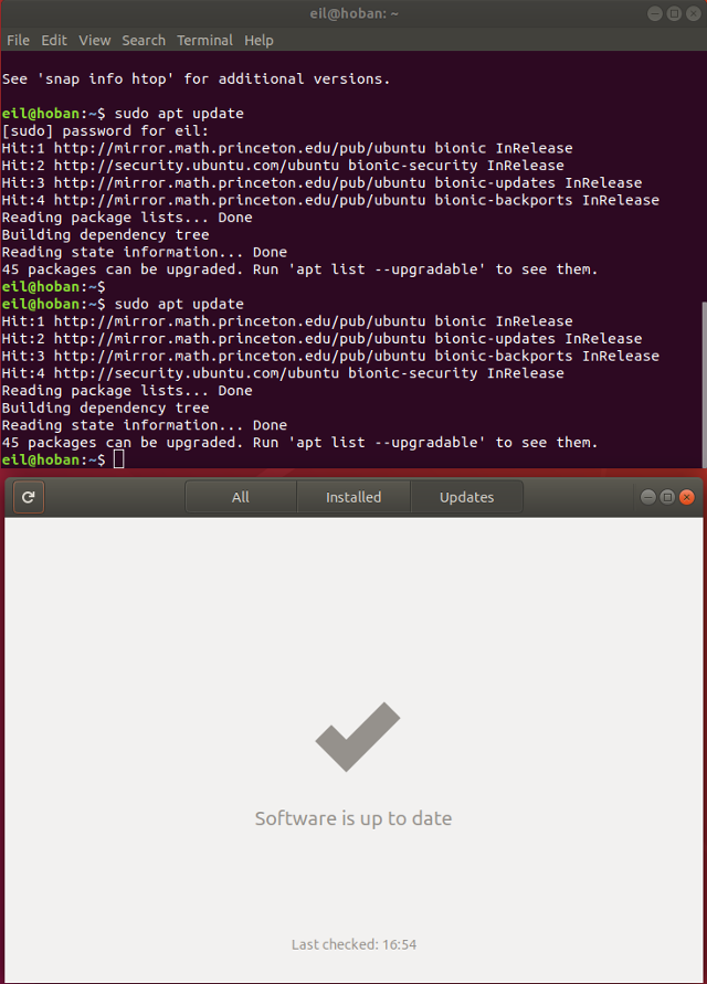
Even after clicking the refresh button, the Ubuntu Software center always tells me, "Software is up to date." But this is evidently not true because if I run "apt update", I am generally told there are updates. My assumption for now is that the Ubuntu Software application only shows updates for packages that were installed through it. Further, the list of installed applications that it shows is very clearly a subset of those that are actually installed on the system. Color me befuddled.
The official Ubuntu repositories are quite often dog-slow for reasons unknown. Busy anthropods like myself don't have time to waste on this kind of nonsense. In order to get any kind of reasonable speed, I had to switch to a third-party mirror. (Thank you, http://mirror.math.princeton.edu/pub/ubuntu.
If you have multiple monitors, you can only set the background of both. You can't set them independently. I guess the developers thought that having different backgrounds on different displays would have been too confusing for users and cause their brains to explode.
And while we're on the topic of aesthetic issues, I still can't work out who at Ubuntu thinks that bright orange and purple is a reasonable color combination for a user interface. Not only is there no way to change this, there doesn't seem to be any way to adjust anything at all relating to the look-and-feel of Ubuntu. Not colors, not widgets, not even fonts. If orange everywhere makes your eyes bleed, you'd better stock up on the tissues now.
Pleasant Surprises
